Friday, 11 October 2013


                      STAIRS


Could'nt resist this dark image. The cast iron gates suggest protection of wealth, whereas the stairs suggest something a little more sinister, almost criminal.
  MARKET ROOF


This is a photograph of the wonderful iron structure of Altrincham Market roof.

I am intrigued by its web of engineering and just had to enter the image for the exhibition.

The only photo shop work I did was to make the image square.


                      PASTEL PRECINCT
Here are some photographic images that I took for an exhibition this week at Art with a Heart in Altrincham.The title of the photographic exhibition is Altrincham Squared.


This image of Altrincham precinct was livened up in photoshop to create a more colourful and welcoming environment. I made the colour translucent to reveal the brickwork.


                PAINT BY NUMBERS


 This image was taken looking down at the train track from an Altrincham walkway.

I then used photoshop to omit small areas and colour white. I then added numbers. I changed the look of the photo by adding a watercolour effect.


All of these images were sent off to a ceramic transfer company. When my transfers arrived I duly layed the transfers onto domestic white tiles, let them dry for a couple of hours and then fired them to 800c. They came out looking lovely and shiny and firmly fixed.

I then took them to the exhibition centre in Altrincham where they will be shown with other photographic works for the next few weeks. Details I will blog very soon.

Wednesday, 18 September 2013

Trains, trams and no automobiles

After my trip to the dolomites I was contacted by Art with a Heart ( Creative Surgery ). I was invited to exhibit some work for their next exhibition. The theme being "Trains, trams and no automobiles".

Initially I thought of creating a mobius circle out of earthenware clay, adding train tracks on both sides, but with little time for experimentation, I decided against the idea.

After much thought, I decided to create a surface design using photo shop and illustrator. I thought train designs are the most obvious, so I had a go at designing some train tickets.


I altered the ticket in Photoshop and erased all the typography . I also erased the logo for copyright reasons.

I transferred the blank ticket design to Illustrator and typed in the new ticket destinations etc. I typed all the main stations on the Altrincham line so it would appeal to the people of Altrincham. As this is where the exhibition is being held.
I then created a new logo.

After printing the image onto the transfer paper. I traced the ticket layout onto the fired wares. I then painted the tracing using mayco glazes. After firing the 2nd time I applied the transfers, then fired again


                                          Fresh out of the kiln !


The ticket design represents the diminishing train on its journey, the logo represents speed and direction.


Large glazed dinner plate


                                                Side plate

Art with a Heart. Creative surgery. Normans Place. Altrincham. 12 - 29 Sept.13 Thurs to Sun 10 to 5


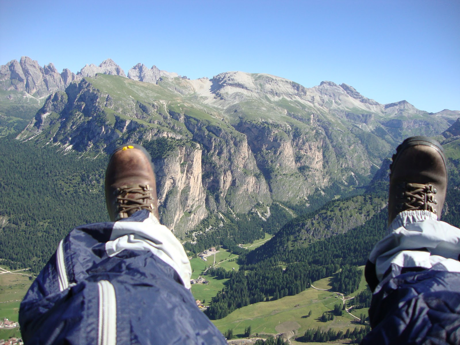
Paragliding in the Dolomites

Italian Alps- Dolomites


Paragliding in the Dolomites
While I was there, I decided to take the opportunity to have a go at paragliding. Wow!!!!
This was the most beautiful experience I have ever had. To fly like an Eagle as high as the Marmorlada was breathtaking. 


So now it's time to get back to work and start being creative again. Life is good.

Friday, 7 June 2013

Lagoon Bloom Collection

wendy wallwork FolksyThis is my new collection.......

I named the collection Lagoon Bloom for an exhibition I am entering in Altrincham in July. The theme of the exhibition is In Bloom, so I was inspired by the name and got busy.


The Breakfast Toast Rack was made using Oxidizing St Thomas and fired to Stoneware. I then coloured using mayco
and dipped in clear Duncan glaze.

I pierced some large holes into the dividers to enable the toasted bread to be nice and crispy !


 The tiles were squared off once the clay had become leather hard.


I prefer this tile, as the colour is much deeper. This is because I used two layers of mayco .


 The bowl has turned out very pretty. I rolled the clay and covered it with a layer of clingfilm before moulding it into an existing breakfast bowl. When it was leather hard I took it out of the mould and removed the clingfilm.

The vases were made using the slab rolling method. I scored and slip pasted the edges to join the two sides and then made a base.


All of the collection was fired to Stoneware and then glazed. The flower designs were made by indents and the stems were created by pressing string into the rolled out clay.


         I made many different samples for the collection,
         and made  notes on different techniques, and
         various firing ranges.

                                           
                                              Some samples had a more desired look
                                              than others.


I love the way the colours pool into
the indents, giving it depth.


Wednesday, 22 May 2013

Hand Thrown Bowls

To purchase go to :                                                                                           
Hand Thrown Bowls


These bowls were hand thrown on the potters wheel. I used a lightly grogged earthenware clay. they were dip glazed on the inside and I brush glazed the outside before layering with different designs. They were fired to 1002c.
This bowl was also hand thrown. Brush glazed and layered. Inspired by oriental designs.
The fruit bowl was wheel thrown. I used the layering technique to create a pretty floral design in contrasting colours. Using mayco glazes. Final firing at 1002c.
This bowl was inspired by the rich colours of the orient. Again it was wheel thrown and layered with glaze before firing.


Monday, 20 May 2013

Brush holder/rack

I made this demonstration piece for a school workshop. The GCSE brief was on organic and natural forms. 

 It was made using white earthenware. The clay was slab rolled and when it was leather hard I cut the 3 pieces out using a prepared stencil. Holes were then pierced before score and slip joining.
 I then extruded some clay using my extruding tool and threaded the thin coil through the piercings.


I then hand moulded the leaves before score and slip joining them on.
After bisque firing I glazed it in contrasting colours before firing again at a higher rate. The threaded coils hold the brushes or pencils in place. The piece helped to inspire the students for their brief.

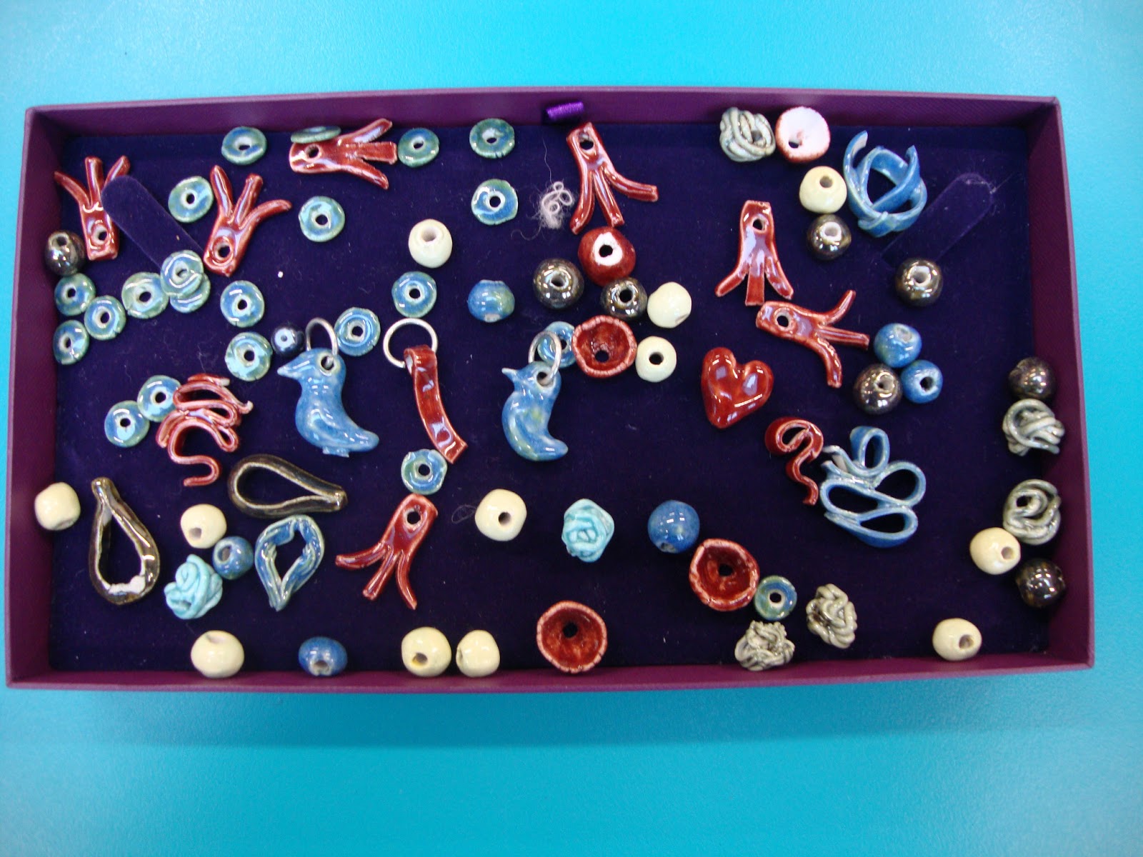
Ceramic beads and pendants


 I recently joined a jewellery beading class at my local library and made a number of necklaces and bracelets using various crystal beads. The beads were interwoven almost like lace making. The class inspired me to make my own beads and pendants.


 These beads were made using porcelain clay. Porcelain has quite a high shrinkage rate so I made them large enough to compensate. I strung the beads on fine camphor wire that I threaded onto a tile rack. After the initial bisquit firing I glazed them using high fire porcelain glazes and mayco glazes.


Some of the beads I fired were used to make necklaces like this one. I used a mixture of pearls and ceramic beads and threaded them onto fishing wire.